…you can approach the paintings more casually, with a feeling of ease—with the sense that these are sketches for larger works. There is less to recognize. There is less formality. There is less area to navigate. The less here feels more.
Alex Katz: Small Paintings 1987-2013
19 September – 2 November ’13
Peter Blum
20 West 57th Street
New York, NY 10019
212.244.6055
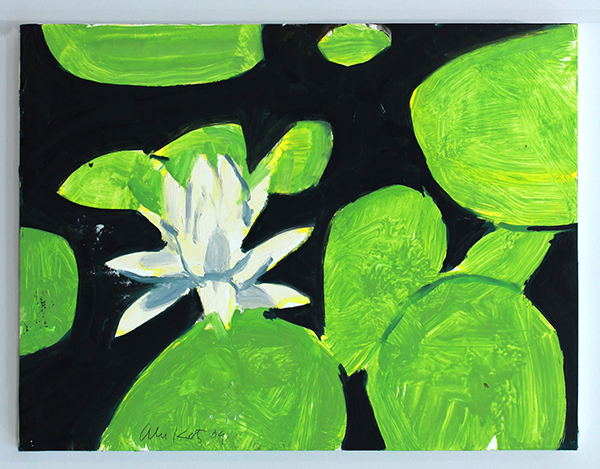
Alex Katz, “Homage to Monet 5,” 2009, oil on board, 9 x 12 in. (22.9 x 30.5cm)
Courtesy the artist and Peter Blum Gallery, New York
A change in scale. A change in tempo. A change in perspective.
We’ve just traveled to some of the Midwest’s best museums–the Nelson-Atkins, St. Louis Art Museum and Cleveland Museum of Art. In each, as in most major institutions, painting’s best, both past— de Kooning, Pollock, Kline, Motherwell, Rothko—and present—Ryman, Marden, and Alex Katz—hang together.
You can almost predict what you’ll see. From Katz, it’s a larger-scaled portrait, possibly of his wife Ada, flattened planes and limited perspectives. It’s what makes the current show at Peter Blum so unique—the chance to view works from this celebrated artist in the up-close—small, intimate and unexpected paintings that for me, bring fresh life to my understanding of his work.
In the show of twenty-five paintings, none larger than 12×16 inches, you can approach the paintings more casually, with a feeling of ease—with the sense that these are sketches for larger works. There is less to recognize. There is less formality. There is less area to navigate. The less here feels more.
Many of these were made in Maine, Katz’s summer retreat.
In an interview with Jane Freilicher, Katz said this about why he uses nature as a subject, “The combination of forms and light in the landscape produces a rush of feeling which translates into the painting. When I have stopped painting on a landscape which is usually a motif seen through my studio window I go outside and I am always amazed by how much more is pouring over my head.”
…you can approach the paintings more casually, with a feeling of ease—with the sense that these are sketches for larger works. There is less to recognize. There is less formality. There is less area to navigate. The less here feels more.
For me, the best works in the show are the landscapes—the expressive marks, the confident use of color, the sense of place. But maybe that’s because I know so well those trees, those lily pads, that light. Or maybe because when I look at Dusk, I can smell the pine.
Subscribe to Tilted Arc
If you like this story, please consider subscribing. We are sticklers for privacy.
We will never sell or share your e-mail address.


