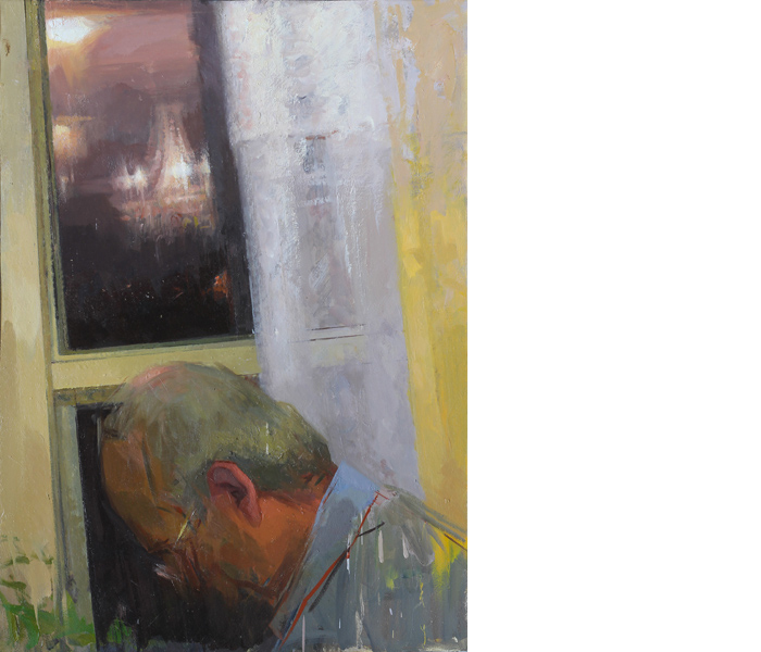
A limited palette lends itself to the method of working from inside out: from the center of a color scale towards its poles. A painting starts within a narrow range of color-values and expands outwards, as I grope to overcome the limitation of the resources and broaden the range of tones, temperatures and color sensations. Minimal additions are made to the initial selection of paints, if at all.

Ilya Gefter ‘Window Portrait I.’ 2012.
© Ilya Gefter. Image courtesy of the artist.
I have been using two different palettes for most of my painting years: a limited and expanded one. Both have been undergoing modifications: colors are being added or substituted, but the essential organizing principles have remained the same.
A limited palette of four paints is the one through which I entered the world of color. It initially comprised White, Yellow Ocher, Blue Black, Burnt Sienna and/or Raw Umber. This was gradually modified and is now comprised of White, Cadmium Yellow Light, Venetian Red, and Blue Black. I start with these four colors and make carefully weighed color- additions as the painting progresses and asks to broaden the chromatic range. But just the four colors can also suffice.
A limited palette lends itself to the method of working from inside out: from the center of a color scale towards its poles. A painting starts within a narrow range of color-values and expands outwards, as I grope to overcome the limitation of the resources and broaden the range of tones, temperatures and color sensations. Minimal additions are made to the initial selection of paints, if at all.
If the relationships are fine-tuned well enough, the greys and browns transcend themselves and are experienced chromatically. If not, they remain the mud that they are.
The frugality of resources must be compensated by richness and specificity of relationships. If the relationships work, very diverse color-sensations can emerge from a simple pool of just a few earth tones. One ought to make color- mixtures feel violet, greenish, orange, etc. without ever using these pigments. This self-inflicted limitation forces to me invest greater care in measuring and adjusting subtle temperature relationships. If the relationships are fine-tuned well enough, the greys and browns transcend themselves and are experienced chromatically. If not, they remain the mud that they are.
At its very best, the limited palette promises deeply satisfying chromatic experience. Carefully related but simple mixtures made up of the same few colors feel naturally harmonious. They can also border on the sublime, as is the case in Fayum portraits. The nameless artisans of 1st and 2nd century AD Egypt used only four earth colors to model those eternally alive and stunningly modern portraits.
When using an expanded palette of about 12 colors, the process is somewhat different. The painting can be built from outside in. I attempt to embrace the full chromatic range from the start. As the work develops I strive to fine-tune the color relationships within the previously established range.
White, Cadmium Yellow Light, Winsor Yellow, Indian Yellow, Cadmium Orange, Cadmium Red Light, Cadmium Red Deep, Burnt Sienna, Venetian Red, Raw Umber, Blue Black, Alizarin Crimson, Winsor Violet, Ultramarine Blue, Phthalo Blue, Cobalt Blue, Viridian, Cadmium Green Light, Veronese Green.
These are the main colors I’ve been using lately. But I would hardy ever use them all in a single painting. While it is increasingly rare that I limit myself to a four-color palette, I do believe that the more frugal my means are to achieve the desired results, the better. Harmony arises out of limitations. Even in an “expanded palette” I prefer to restrain the number of pigments, trying to use no more than 2 colors of the same hue in any given piece.
However, the more limited the palette is, the more crucial is the choice of each pigment. I usually use Venetian Red by Old Holland, Raw Umber by Old Holland, Raw Umber Green Shade by Winsor and Newton, and Blue Black from Winsor and Newton. When using an expanded palette, I feel more freedom to experiment.
Backstory: a new series on Tilted Arc. Artists and writers on process and intention.
Subscribe to Tilted Arc
If you like this story, please consider subscribing. We are sticklers for privacy.
We will never sell or share your e-mail address.


